


The corporate logos of South Africa’s telecommunications companies have evolved alongside technology, growing from abstract representations of once up-and-coming connectivity start-ups to the symbols of some of the most iconic and easily recognised brands in Africa.
An interesting observation is how strongly the earliest logos attempted to communicate something about what each company did. Their latest iterations, however, are much more minimalistic – indeed, it appears that minimalism in corporate logos is the new black.
On one hand, this is a reflection of how design has evolved over the years, abandoning the ornate in favour of simplicity. On the other hand, it suggests that these brands are so well-established that their names alone are enough to communicate effectively given that the public is aware of who they are and what they offer.
“South African brands have moved from loud, layered, identity-heavy visuals to cleaner, more confident minimalism,” brand and marketing expert and journalist Jeremy Maggs told TechCentral.
“In the early days of democracy, design was expressive and bold – almost a celebration of freedom. But today minimalism signals maturity. It says we know who we are, and we don’t need to scream for attention. In a world flooded with content, clarity is king.”
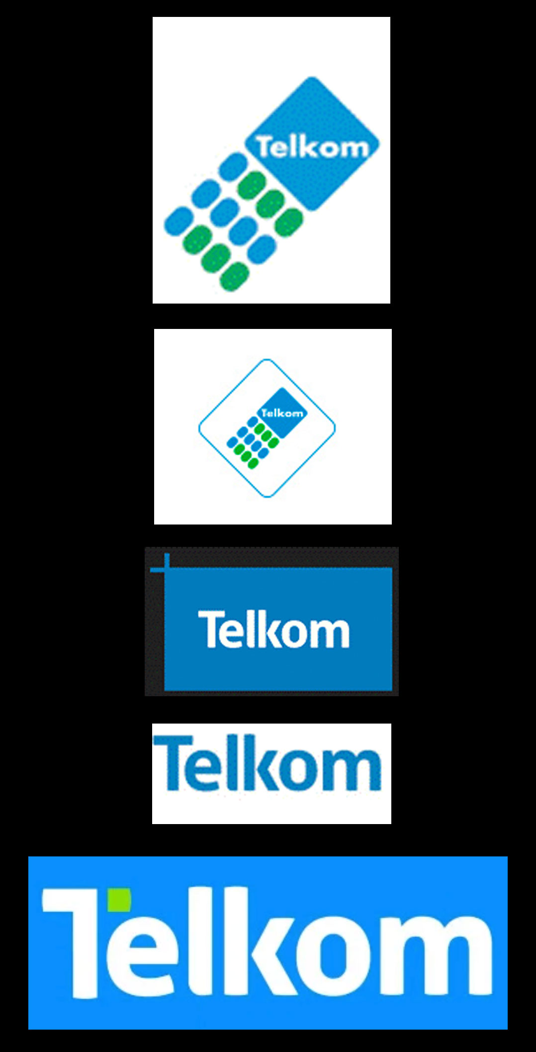
Telkom was incorporated in 1991, transforming the landline operator from a fully to a partially state-owned company that was later publicly traded on the JSE. Telkom’s first logo was symbolic of the landline era, showing a dial pad on a fixed-line telephone. But a new age was already dawning.
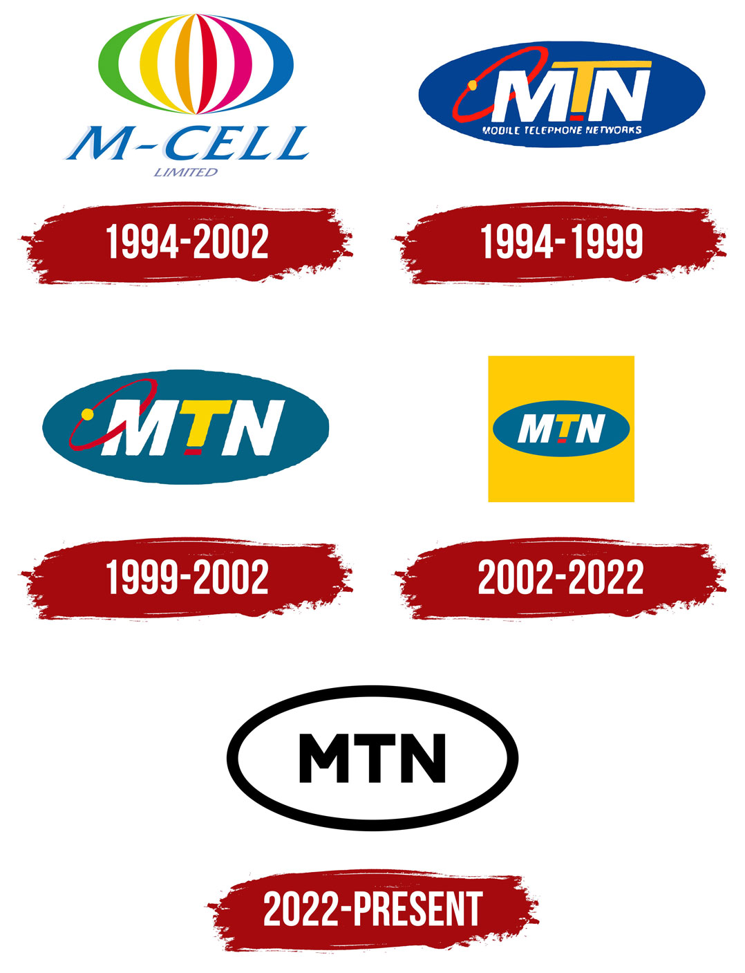
Only three years later, in 1994 – the year of South Africa’s first democratic election – Mobile Telephone Networks (MTN) and Vodacom burst onto the scene, catapulting South Africa into the mobile communications era.
Pixel perfect?
The red swoosh connecting to a yellow dot in MTN’s earlier logos symbolised connectivity. Vodacom’s first logo had a similar design, utilising a swoosh around a globe, giving the impression that mobile connectivity made the world smaller and more accessible.
The companies’ logos did not change much for years, with only subtle changes to each design taking them slowly towards a more minimalist ethos that has come to dominate modern logo design. But there were other factors influencing the shift towards this minimalism.
With the growth of digital media, the consumption of branded material began shifting from static billboards and print advertising in newspapers and magazines to dynamic webpages. The need for logomarks and logotype to perform well on different-sized screens – from smart TVs and laptops to tablets and mobile phones – meant ornate elements that often got pixellated when resized had to go.
…article continues below…
“On a mobile screen, you have a few seconds and even fewer pixels to make an impact. If your brand looks like a birthday flyer from 1998, you have lost the game before it starts. Digitisation has forced brands to trim the fat, sharpen the message, and think in scrolls and swipes, not posters and billboards. Minimalism isn’t just stylish; it’s functionally essential in a screen-first world,” said Maggs.
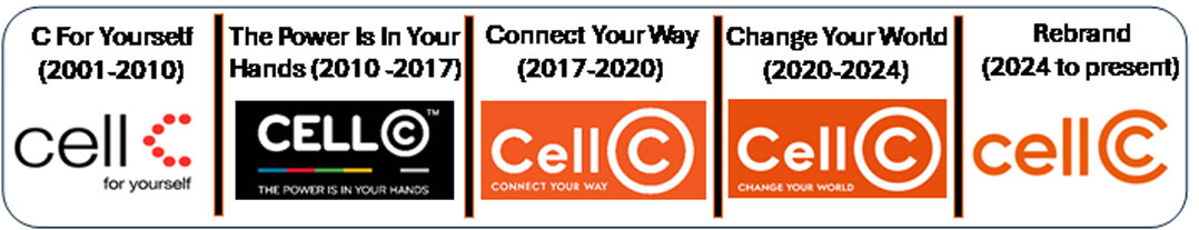
When Cell C was launched in 2001, its distinctive dotted “C” had more impact on television where the “C” was animated. In 2010, Cell C changed its entire colour scheme with a transition to black-and-white styling. And this would not be the last time Cell C would completely overhaul its branding as its fortunes swung tumultuously in the years that followed. Now, after completing a recapitalisation and under new leadership, it has settled on an orange design with a distinctive circular “C”.
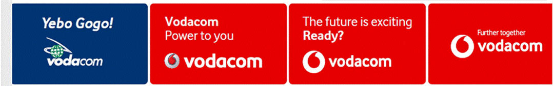
Vodacom Group also overhauled its logo design when it changed colours from blue and green to red in 2011 to align with the brand identity of parent Vodafone Group. The change included discarding the globe in its logo for a speech bubble (Vodafone’s so-called “speechmark” icon).
Around the same time, Telkom moved to ditch its legacy landline dial pad design. By 2011, it had launched a new mobile offering called 8ta, whose branding was quickly ditched in favour of “Telkom Mobile”, better aligning South Africa’s fourth mobile operator with the group brand.
…article continues below…
Telkom’s adoption of a minimalist logo with a plus sign cropped into the top left corner – as opposed to a symbol of a single technology from a bygone era – symbolised the company’s changing focus, incorporating traditional landline, mobile, fixed-line copper and fibre connectivity solutions under the same umbrella.
Cell C adopted a new colour scheme in 2017. With the primary colours red, yellow and blue already taken by Vodacom, MTN and Telkom, respectively, Cell C opted for an orange and white colour palette to set it apart. Cell C has reinvented itself a number of times, with the latest refresh announced last year.
Telkom did the same just last month. Like the other operators, however, more recent changes are minor as they seek to maintain the brand’s core identity as an established market player.
Read: From MTN to IBM: the tech industry’s best slogans and payoff lines
“Reputation is gold, but even gold needs polishing. A 30-year-old brand needs to ask: are we still relevant, or just remembered? The danger is fossilisation. South African consumers today are young, digital and impatient. A brand refresh isn’t about ditching your legacy, it’s about making sure your legacy speaks in the language of today,” said Maggs. – © 2025 NewsCentral Media
Get breaking news from TechCentral on WhatsApp. Sign up here.
Don’t miss:
The first mobile phone calls in South Africa – how it all began